Review Overview
Interesting content - 9
Easy to read - 4
Usefulness - 6
6.3
An interesting illustration of global inequalities using maps and charts, but the data will go out of date quickly.
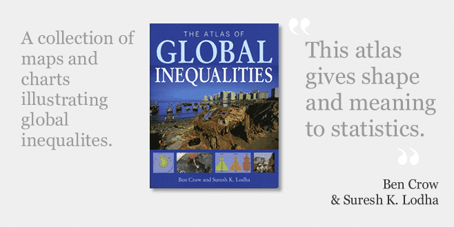
The Atlas of Global Inequalities by Ben Crow and Suresh Lodha is one book in a series of international development atlases published by The University of California Press. The same series includes titles such as The Atlas of Human Rights and The Atlas of Climate Change. The purpose of the atlas is to illustrate statistics on global inequalities through maps and charts. It covers all areas of inequality, including economic, power and social inequality, and inequalities in access, health, education and the environment.
As someone who is obsessed with creative ways to show data (if you’re not convinced see my TEDx talk) I was very exited to find the atlas in my local bookshop. I thought it would be a great way to explain global inequalities to the uninitiated, and I could use it as inspiration for my own charts and graphics. Unfortunately, it didn’t completely live up to my expectations.
The first hint of a problem was in the opening paragraph where the authors define equality as “the idea that each person should have comparable freedoms across a range of dimensions”, and inequalities as “constraints that hinder the accomplishment of those freedoms”. While these definitions would be completely at home in a Ph.D dissertation or UN agency mission statement, they aren’t really the type of plain English that I would expect in this type of book.
Another pet hate of mine is the author’s use of global “South” and global “North” to refer to non-industrialised and industrialised countries (it’s not just my own pet peeve, the term also made it onto WhyDev’s list of development phrases they hate). As someone who comes from an industrialised country (Australia) which is clearly located in the Southern hemisphere, and works in a non-industrialised country (Cambodia) which is in the Northern hemisphere, I find these terms extremely confusing. It is particularly frustrating in an atlas which has page after page of maps clearly showing that hemispheres and development have nothing to do with each other.
Despite my geographic frustrations, the atlas does have 100 pages of beautiful double-page spreads. Most of the maps and charts look great, and do a good job showing the scale of inequality in the world. The authors also acknowledge the limitations of using only national level statistics, and include some within-country comparisons to demonstrate this.
Although the charts were all very beautiful, I did feel they lacked a bit on the usability side. I often had to look twice, and had difficulty understanding exactly what some of them were showing. In many cases the facts in the text-boxes were even more striking than the charts themselves, and could make great opening lines for a last-minute proposal or presentation. Typical examples include:
“Indigenous peoples: 5% of the world’s population. 15% of the world’s poor”
“A woman’s chance of dying from pregnancy or childbirth: Sub-Saharan Africa 1 in 16, OECD countries 1 in 3,800”
“Developing countries are 80 times more likely to be affected by a climate disaster than OECD countries”
The main problem with the atlas is that the data will go out of date very quickly, so you would need to buy the latest edition each time – assuming new editions are released. I personally find it much easier to just go directly to the source. Many of the UN databases, as well as the free Gapminder software, allow you to make your own maps and charts using the same national statistics.


